Value grouping
Often times when planning compositions for paintings, students tend to only think about arrangements of shapes and lines but forget about value. Applying principles like the rule of thirds, balance or other design principles can get you really far, but thinking about grouping values will bring your compositions to a whole new level.
You don’t want to forget about the importance of good values arrangements and structures.
Readability is key
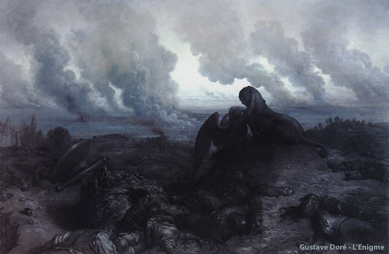
The best compositions in art are often times simple. They share easy to read shapes that can be recognized within seconds. In the example above, Gustave Doré grouped his light and dark families together. By doing so, they make up simple shapes that benefits the readability of the picture.
Avoid over detailing with lines, shapes and values so the viewer doesn’t get confused. The more confused, the harder it will be for the viewer to understand the picture and it’s underlying message. The lower part of the painting depicts an aftermath of a battle and it contains quite some details, but by linking the values together, it reads as a whole. The burning city of Paris and sky are linked as well, to improve the readability.
By bringing the values closer together in busy areas, we can reduce that area to one simple shape. If you apply this technique throughout your whole canvas, you will have grouped the light and shadow areas to simple, easy to read shapes. This will benefit the readability and therefore composition of your painting.
On areas that matter, i.e. focus areas, you want to arrange your values so that they are contradicting with each other. By having a black on white or white on black, we pull the viewer back to those contrasting areas of your painting. In Doré’s L’Enigme, this happens around the head of the sphinx.
In conclusion
- By grouping our values together we can create more harmony in our compositions. That’s why you’ll often hear artists telling you to limit your values
- The fewer the values, the better the read. I personally like to limit my values to a light, mid and dark
- Outbalance your values so you achieve contrast in their ratio. E.g. 60% dark value, 30% mid value and 10% light value
Let me know if you already use this technique and if it helps you getting better reads in your compositions. Maybe you use other techniques? I would love to hear about them in the comment section below.