In a previous article I mentioned the importance of visual library and how we can build it. I stressed the importance of studying and actual understanding your references, rather than simply copying the reference one on one.
But if you’re just starting out, it can actually be a good idea to exactly copy the reference image by doing photo-studies. By doing so, you give yourself some time to get used to your digital painting program, it’s interface and how blending with a Wacom tablet works.
What to study?
Making copies of photos or still frames, often referred to as photo-studies, worked great for me. The subject of your photo doesn’t really matter, as long as it’s not distracting you to focus on your learning goal. Reference images with complex perspective, poses or lightings may be too overwhelming, dispirit you and will distract you from your main goal.
Reference from what interests you and what you like. Remember, whatever the subject, they are just volumes, made up of surfaces with value changes.
Once you get used to your digital painting environment, you change your focus to understanding how values relate to each-other and how they communicate the changes of our forms. Color is just this extra dimension that can easily distract us, so avoid dealing with colors for now.
If you have other ways of studying, please let me know!
How to study?
What techniques you use to make the photo-studies mostly depends on your personal preferences and differs from artist to artist. Sometimes it will be necessary to follow one or another workflow because of pipeline restrictions.
There are a lot of techniques to start a painting but I like to define the following two to get you started:
- Line-art:
I would advise to start with a line-art when dealing with images that have complex perspective or subjects. That way you can plot out the complex parts first and concentrate on the values later on. - Blobs of values:
When you start with blobs of values, you can mainly focus on light, shadow and there respectful values.
Another factor to consider is the amount of layers you will be using. The following pointers can help you decide which workflow would be the most suiting:
- Having separate layers (if changes might be needed later on / Animation purposes):
+ Easy to adjust and move around
+ Should be used when texturing
+ Easier to achieve a clean digital look
– Makes your document size bigger and Photoshop slower
– More time consuming while working (but can save you some time afterwards)
- Having one or few layers (For quick photo-studies / Style purposes):
+ Quick and easy
+ You don’t get lost and overwhelmed managing layers
+ Adds to a less clean digital look but a more painterly look
– Almost no room for quick and clean adjustments
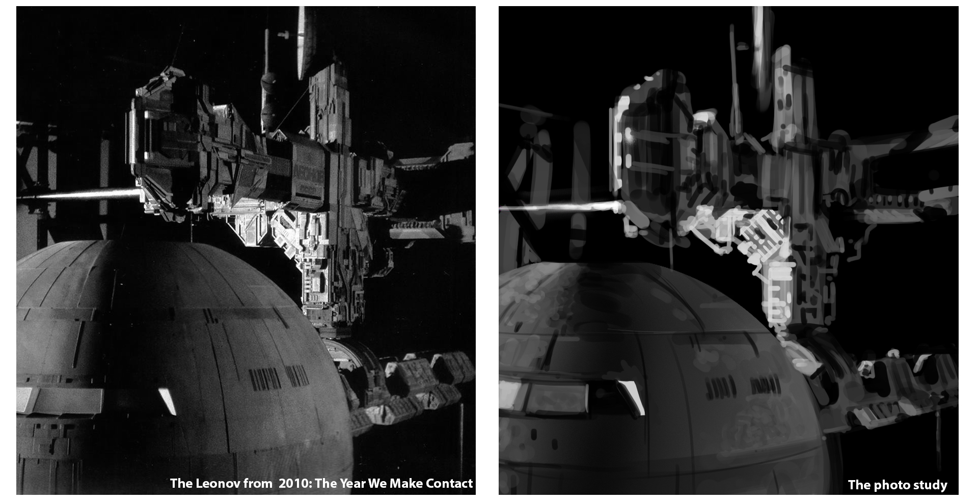
When making your photo-studies, consider this
- Put your reference image in greyscale so we put the dimension color out of play
- Do not color pick your values. It of the utmost importance that you try to see and understand the values by manually selecting them in your color picker. When in doubt, you can always compare your selected value by painting on your reference image
- You don’t have to create a grid on top of your reference image to get the proportions exactly correct. Creating a perfect replica is not our goal
- Place the reference image and working document along each other (In Photoshop: Window Menu » Arrange » 2-Up Vertical / 2-Up Horizontal)
- Stay zoomed out to avoid losing too much time on non-important details
- Render the bigger shapes first, don’t get lost in details too soon, as those will only distract from a clear readability. Squinting your eyes can help to see the main forms and values
- Flip your canvas regularly to spot mistakes more easily
- Set up shortcuts for tools or settings you often use, in Photoshop, you can assign shortcuts to almost every tool or option
- Avoid using the undo-tool. A lot of my students waste a great amount of time by using the undo-tool when they make a small mistake. I’m serious about this, remove the shortcut for now
- As it is often interesting to try out new brushes, don’t expect brushes to be shortcuts to great art. Understanding the fundamentals is still key here, so I advise you to stick to a regular round brush for now
- Keep it light and breezy. Better results are already visible after 7 photo-studies so don’t give up too soon
To help my students in building their visual library and getting better at digital painting, I created a Weekly Challenges Facebook group. It’s a place where people can post their studies and learn from each other. It’s open for everyone, even if you’re not one of my students or following Digital Arts and Entertainment. Feel free to join and share your photo-studies!
Great article, Lino! I was looking for informative content about studies and, at last, I found it here. I struggle to set drawing and painting excercises for best results. On your blog are tons of priceless informations. I will be coming here often. Lots of it is in the web around but here they are one placed and well served. Thank you! 🙂
Hello Michal,
Thank you for your comment, I’m glad this helps :)! Let me know if you’re interested in other topics you would like to see in the future!
Any tips on complex landscapes? and how to memorize them in our visual library example jungles etc?
Hi Sharyar, thank you for your comment.
Here too, it comes down to simplifying your shapes and values first. I would break them down in easy to understand and readable masses of light and color. Start with the darker values so you can paint the light on top of it.
Drawing from reference is key because jungles come in a lot of different shapes and sizes. I can imagine sticking a whole ‘jungle’in your VISLIB, especially if you don’t happen to see one every day, is quite hard. There is no problem using references for complexer landscapes.
Here are two links that can help you further. These are not digital works but the same techniques can be applied nevertheless:
https://drawpaintacademy.com/how-to-paint-leaves/
http://gurneyjourney.blogspot.com/2019/06/weird-forest.html
I hope this helps,
Lino
Very interesting! However, I was wondering if there were any rights and copyrights issues when we put our studies on sites like ArtStation based on reference photos. Do we have to credit the photographer or the company behind the photo?
Couple of things to consider:
1. If you change the reference to such extent that the original work/reference is not recognizable anymore, then there should be no problem posting it
2. If the reference is not protected by copyright, there should also be no problem posting. Each major search engine has filters to sort copyrighted and non-copyrighted images. Most of the time, if the reference image is not shot by a professional artist/photographer, there should not be any issues.
3. If it is protected by copyright, crediting the photographer is the most common thing to do and should be enough
4. If you do a study of someone else idea/design/work, crediting the artist is also necessary
Hope this helps!