Contrast is one of the most important rules to consider when improving your compositions and dealing with focus points. We can define contrast in shapes, values and colors.
Have a closer look at the examples below: The statue of the figure clearly reads because of its dark value on the bright sky. In the second example we have a contrast between the rounder shape of the tower of Pisa and it’s cathedral next to it, which consists of straight forms and lines. Finally, the last image hows a red color that act as a a color contrast in the green environment.

Complexity vs Simplicity
From reading the previous chapter on Composition, we learned that the eye gets attracted by areas of detail. By putting areas of high contrast next to areas of low contrast you’ll attract the eye. Shapes can range from big to medium and small. The bigger the shapes the more emphasis you can create. Your object is just way more prominent that way.
A good ground rule is to put only detail in the focal areas. Don’t put a very detailed area next to another detailed one. In order to keep your compositions readable, you want to keep areas that aren’t crucial to the mood or story more dim and simple. That way you’re creating these spots for the viewer’s eye to rest.
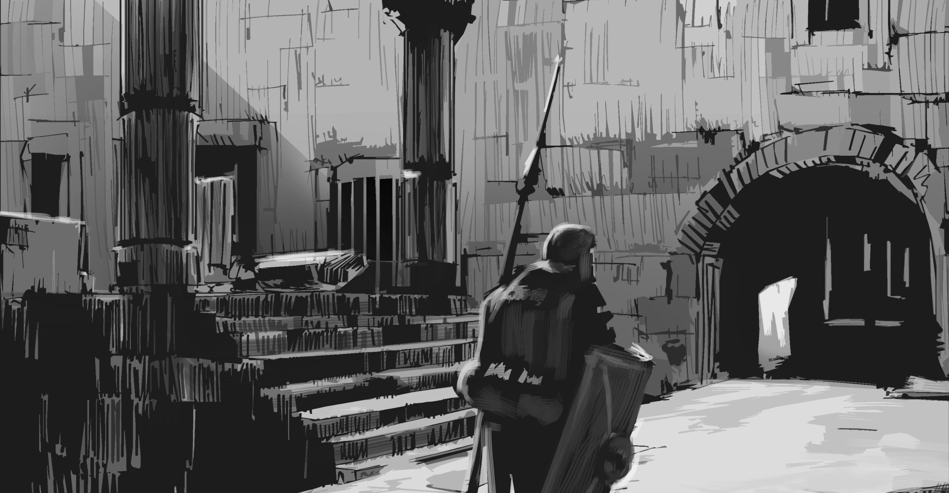
The highest contrast
Contrast in values has a lot to do with readability. If we declare values as being either light or dark we can come up with the following schemes or patterns:
- Light on Light (LL)
- Light on Dark (LD)
- Dark on Dark (DD)
- Dark on Light (DL)
The LD or DL patterns will create the highest contrast possible and are therefore the most interesting for us to use in our focus point and focus areas.
Avoid putting your darkest darks and lightest lights in unimportant areas, otherwise, you’ll create an area of high contrast that attracts the eye. A good ground rule is to put only high contrast in your focal areas. By using the LL or DD patterns we can reduce areas to simpler shapes with lower contrast.
By using different patterns you can shift the focus point in an image. The image below shows the same scene but with different value patterns applied:

Dynamic values
In another post I talked about grouping your values to make your compositions more impactful. Next to grouping your values in a clever way, you can think about making your value structures more dynamic.
By adding contrast in the ratio of darks, mediums and light we can make our structures more dynamic looking. Having 60% dark value, 30% mid value and 10% light value will be more dynamic then a 33% dark, 33% mid and 33% light value. By thinking about the ratios first when planning your composition, you can make better decision how much and where to place your values.
Depth
More depth can be achieved be altering your light and darks throughout your painting.
By creating this light and shadow arrangement in the painting below, I was able to pull the depth in this piece. Altering the color temperatures is another great way to pull the depth in your work. You create this temperature scheme that allows the viewer to go from warm light areas to cool shadow areas.

In conclusion
- A good ground rule is to put only detail in focal areas
- Dim areas that aren’t crucial for the overall painting and leave areas for the viewer’s eye to rest
- A good ground rule is to put only high contrast in focal areas
- Start grouping and outbalancing your value ratios to make more unified images and more striking compositions
- Create light and shadow arrangements to pull the depth in your works
Let me know how you handle contrast in your compositions in the comment section!