Sometimes the stress of coming up with good compositions can be overwhelming at first. In that case I would advice you to use the Rule of Thirds and the composition principle Balance. It will make the blocking in of your main shapes in the beginning stages much easier and you’ll be one step closer to a working composition.
Rule of Thirds
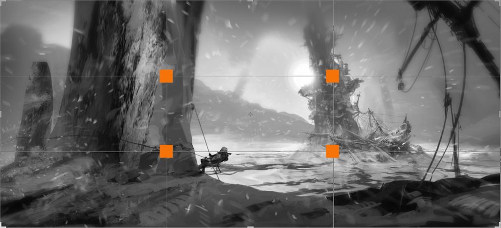
To avoid placing your focus points in oddly positions, like the corners of your frame, you might want to consider using the Rule of Thirds. To use the Rule of Thirds as a guideline, you divide your canvas in nine equal portions. This can be done by placing two horizontal and two vertical lines. As a result, those four lines will create four intersection points. Four positions on which you can safely place your focus points. (In Adobe Photoshop, the crop tool (c) allows you to overlay the frame with different composition rules, such as the Rule of Thirds).
It is not so that the focus points have to placed exactly on one of these four positions, around it would work as fine. But it will steer your away from the corners and middle of your frame. Places that lead to odd placements of elements. Plus, if you approach it correctly, it gives your focus points some more breathing space as well.
Rules like this can definitely be broken. If your picture only consists of your focus point, and you want to make a bold statement, I can see the positioning of the focus point in the center of the image work. Or when your image has a religious approach to it, you also might want to consider placing your focus point directly in the middle of your frame.
Balance
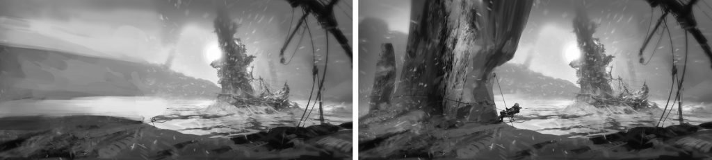
Balance is all about the visual weight in your piece and has a lot to do with you ‘feeling’ the image. It’s the distribution of shapes, values and colors. Let’s compare the two images below.
The image on the left is too heavy on the right side, making the image feel unbalanced. It literally gives you the feeling it would tip over to the right.
In the image on the right we created a better feeling of balance. By using a darker shape on the left (rock face), we counterbalanced the right part of the painting. A common way to check the balance in a painting is by flipping the image horizontally. If the painting feels right in the original and flipped image, you successfully achieved a nice balance!
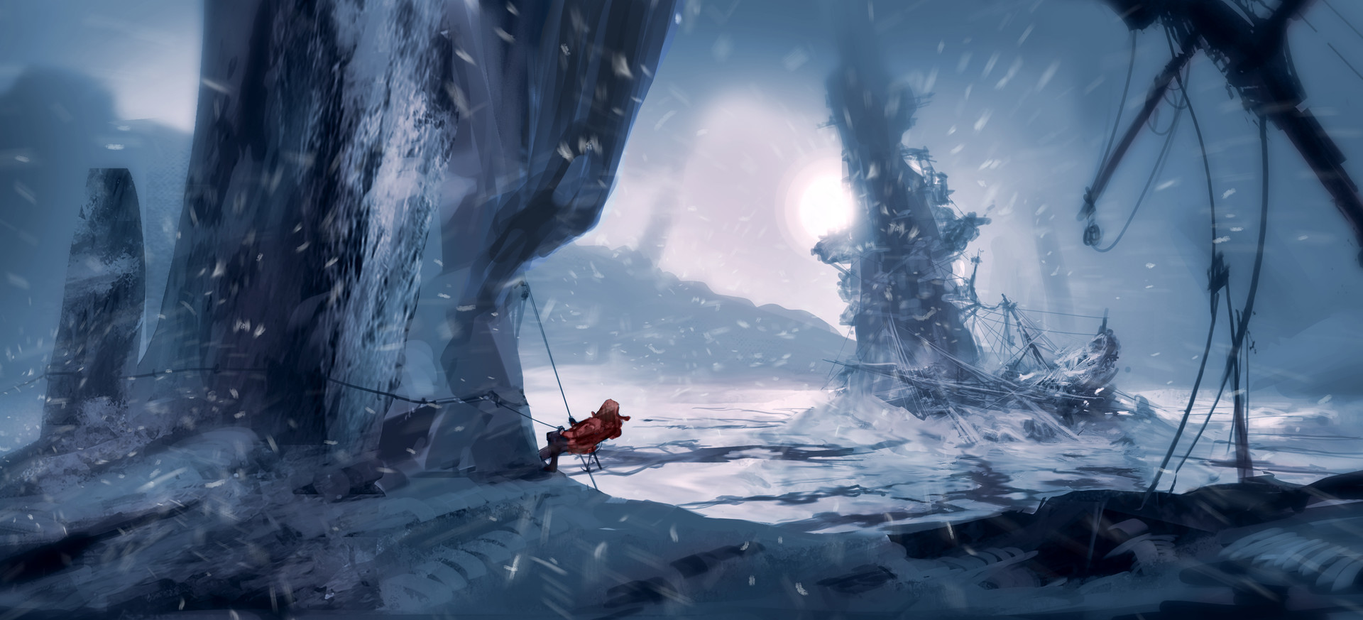
If I was able to go back in time and give myself some feedback on this image, I would advice my younger me to move either the rock, or structure with the ship, more to the edge of the frame. It is seldom a good idea to divide the total space of an image in two equal parts. Most of that has to do with good design, especially contrast, a principle which I discussed in the article Design principles in concept art and design. If objects are equal in size, you make your point of interest the biggest one.
Let me know what helps for you to come up with working compositions!