In this post I want to explain my process of making color studies with photos, and how using those photos will speed up that process. Photos are not only great to add some texture and material definitions, but photos can also help to set your light and color scheme.
Color studies with photos
I always start with a composition sketch that explains my story. Every time I start a new project, I also gather references that gives me an idea of the principle of atmospheric perspective, objects and story details. By having a wide range of references and inspirations, you can base your value scheme and colors on existing photos or moods.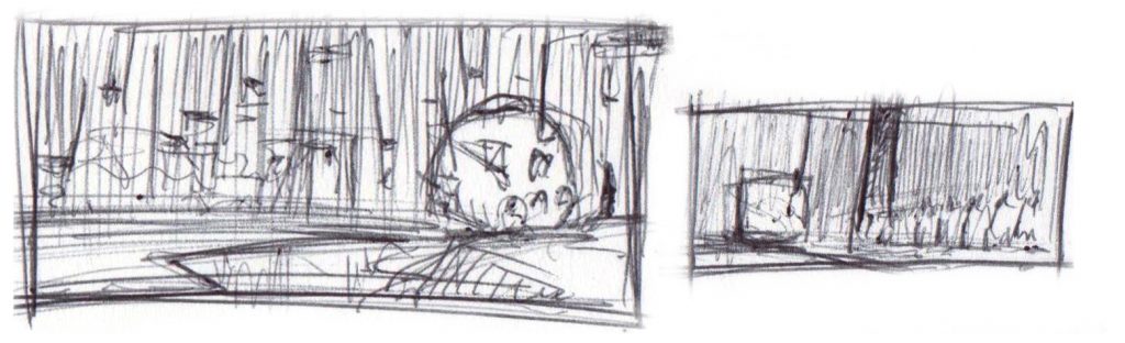
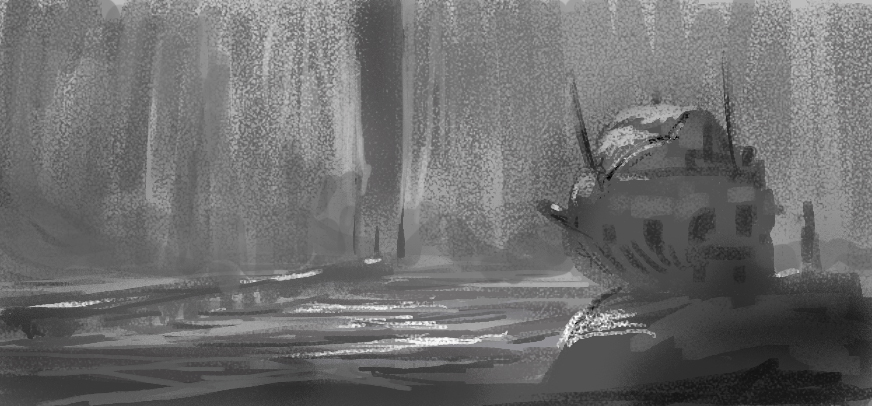
Like discussed in my composition principles series, we need to achieve the aspect of depth by using overlap, atmospheric perspective and grounds (fore-, mid- and background). Once the grounds are blocked in, I proceed thinking about the direction of the light. By using the brush or gradient tool, I achieve the feeling of volume. Each ground will have its limits in dark and light values.
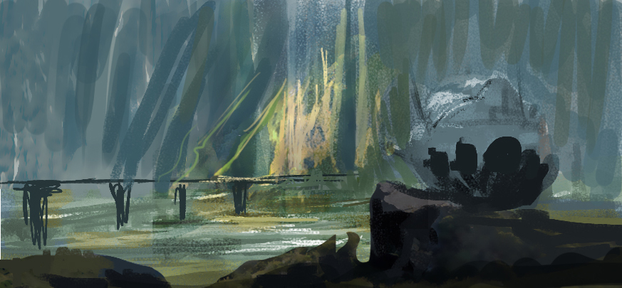
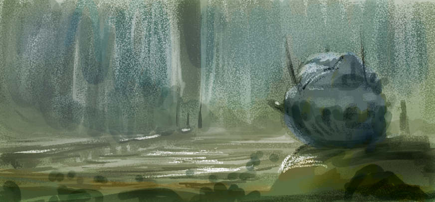
With CTRL+U – Colorize, I add color to my greyscale rendering. Multiple copies will allow me to add other colors as well. Create a blue, yellow and green band of color, that way you create the feeling of atmospheric perspective. The closer you get to the foreground, the more saturation you can add.
Remember, how you get to add colors to your greyscale render doesn’t really matter, a gradient map can work as well. In the end, it’s not how you get there but what you deliver. By using the layer blending modes, more colors can be added, values tweaked and shapes altered.
Speed up your coloring process with photos
To speed up my coloring process, I extract light and shadow information from photos or own sketches. Furthermore, I can use these photos to extract materials and textures. A couple of pointers though:
- Make sure the photo has the same light direction as your scene
- Make sure the scale, distance and detail of texture of the photo matches the scale, distance and detail of the ground you want to apply the photo on
- It is important to match the value range of your ground as well
- You might want to use the Surface Blur or Dust & Scratches filters to blend to photos with your painting
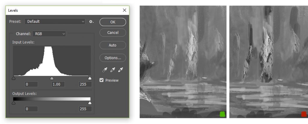
To make sure the applied photo has the same value range of the ground you’re placing it in, you can add a black an white adjustment layer on top of your layer stack. By turning that layer on and off, you can easily match the values. Think about working in greyscale and color simultaneously, I explain how that works in a YouTube video.
In the example on the left, the value range of the photo is matched with the value range of the background. No value corrections are applied on the photo in the example on the right, messing up the value scale.
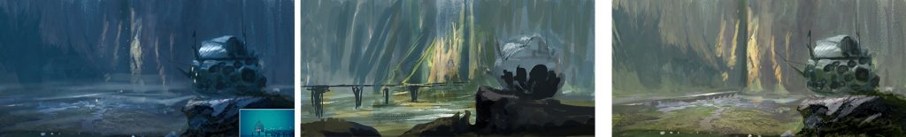
By using different adjustment layers you can easily make different mood studies. Just changing the hue and saturation won’t do it! Think about finding an artwork or photo with an interesting color sheme. That way you can use the Match Color option in Photoshop (Image – Adjustments – Match Color). Adjustments layers such as Color Lookup and Photo filter will also work well. Use the Layer Style options of each layer to control your light and shadow.
Let me know if this techniques works for you as well and if it’s any clear to you. I’m definitely interested in other techniques, so feel free to share those in the comments!
Good luck.
Very useful tips. I sometimes use layer blending modes like multiply or overlay but almost everytime some extra adjustment layer is need to match values or colors. Will watch your video. Thanks! 😉
No problem Michal! Keep me posted on how it goes.